Adding shadow to text has never been easier. With CSS3, using the property “text-shadow” you can create a large number of text effects such as 3D, long shadow, neon lights, retro shadows, 3D glasses effect and many more. With all of these you can take your web and mobile designs to a whole new level.
In the list bellow you will find a list I put together of some of the best CSS text shadow examples I could find on CodePen. Enjoy!
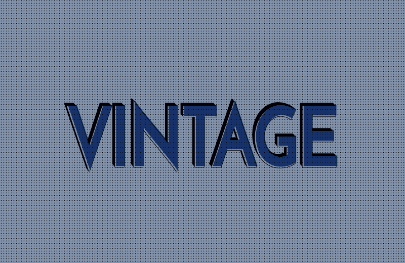
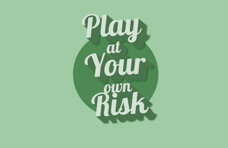
Vintage Text Shadow
A cool CSS text shadow with a vintage/retro colors scheme.

See the Pen Vintage Text Shadow by _twosmalltrees (@_twosmalltrees) on CodePen.
Animated CSS Text Shadow
An animated 3D text using CSS shadows.

See the Pen Animated CSS Text Shadow by Yeet123456 (@Yeet123456) on CodePen.
Peel Letters With Animated Text Shadows
A CSS animated text shadow that changes when hovering over each letter.

See the Pen Peel Letters With Animated Text Shadows by stellaleealbright (@stellaleealbright) on CodePen.
Red Blue 3D Movie Text Shadows
A cool red & blue 3D movie glasses effect applied on a text using CSS shadows.

See the Pen Red Blue 3D Movie Text Shadows by simurai (@simurai) on CodePen.
CSS 3D Text Shadow
A soft (marshmallowy) CSS 3D text styled using shadows.
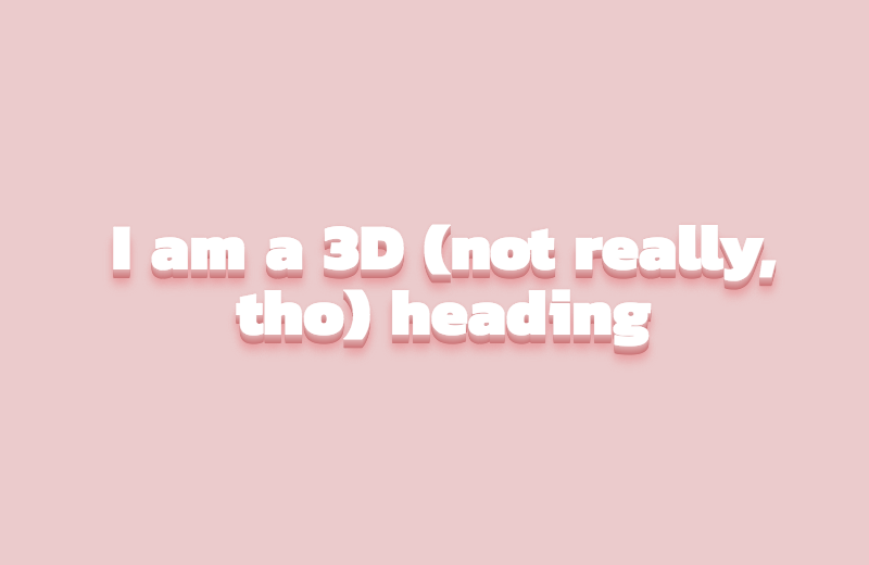
See the Pen CSS 3D Text Shadow by ilmuku-cerdas (@ilmuku-cerdas) on CodePen.
New Retro Wave Text Shadow Animation
For all the 80s worshipping synth outfits out there at the moment. A cool text shadow animation using CSS.
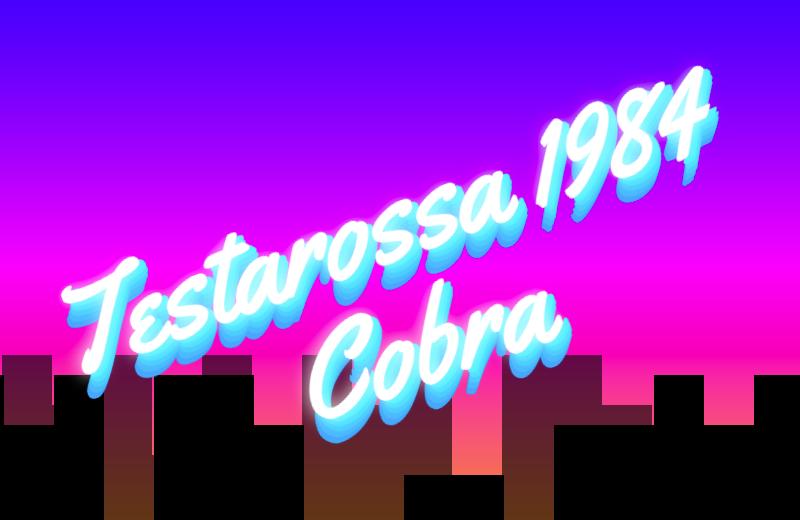
See the Pen New Retro Wave Text Shadow Animation by njmcode (@njmcode) on CodePen.
Shaded Text
Shaded Text, a SVG & CSS3 experiment about animated shadows. It isn't optimized for mobile devices… yet.
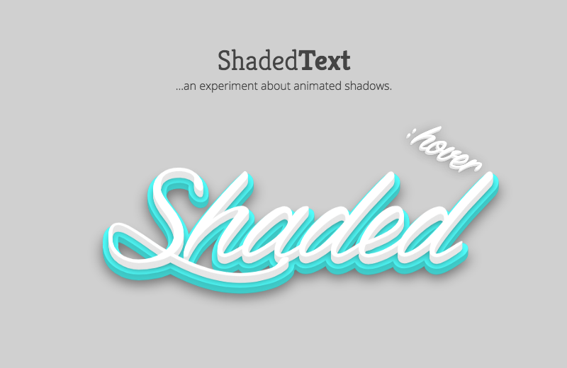
See the Pen Shaded Text by rgg (@rgg) on CodePen.
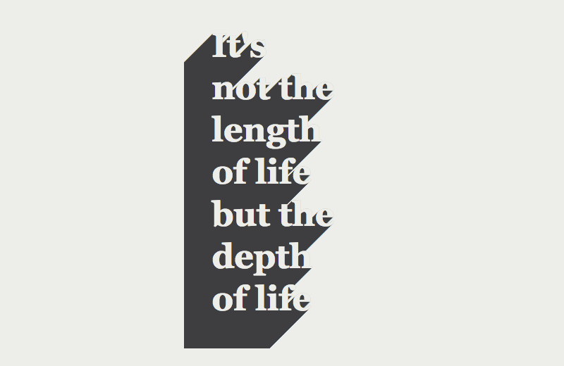
Long Shadow Sass Mixin
A mixin to create easily create the newest fad in design: long text shadows!

See the Pen Long Shadow Sass Mixin by danieltott (@danieltott) on CodePen.
[webkit] CSS Animated Text-Shadow Pattern
Uses `-webkit-background-clip: text` & `linear-gradient` to simulate striped text shadow.
![[webkit] CSS Animated Text-Shadow Pattern](https://cdn.freebiesupply.com/blog/29-11-2018/animated-text-shadow-pattern-p2.png)
See the Pen [webkit] CSS Animated Text-Shadow Pattern by carpenumidium (@carpenumidium) on CodePen.
Vintage Text Effect
CSS only text effect using data-attributes, pseudo elements, text-shadow and blend modes.
See the Pen Vintage Text Effect by mandymichael (@mandymichael) on CodePen.
Text-Shadow
A funky CSS text shadow perfect for flyers, banners, ads, etc.
See the Pen Text-Shadow by mayurelbhar (@mayurelbhar) on CodePen.
CSS3 Text-Shadow Effects
Here are four text shadows using different CSS styles: elegant shadow, deep shadow, inset shadow and retro shadow.

See the Pen CSS3 Text-Shadow Effects by juanbrujo (@juanbrujo) on CodePen.
Animated Text-Shadow
A fun, CSS animation that creates a bounce while mimicking an RGB separation during the process.
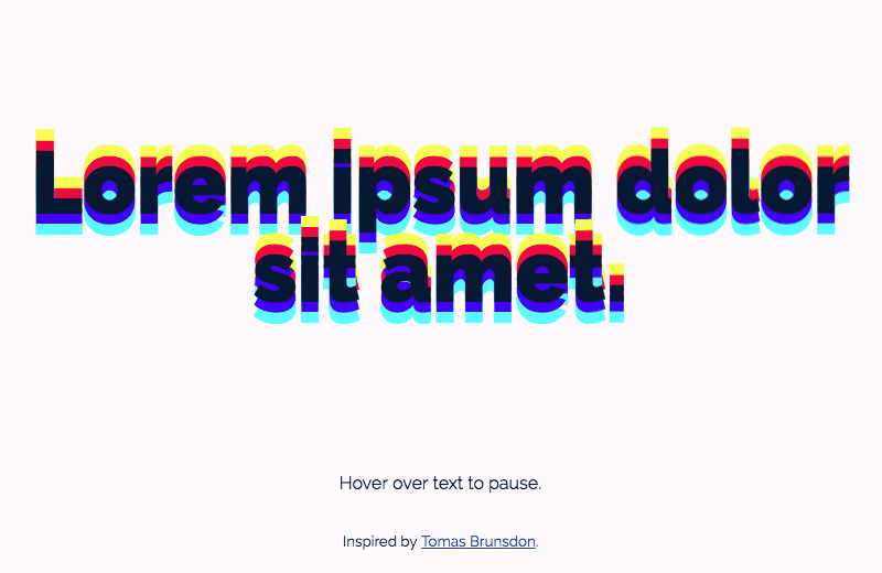
See the Pen Animated Text-Shadow by erinesullivan (@erinesullivan) on CodePen.
Neon text-shadow effect
Awesome set of nine different neon text-shadow effect using CSS and JS.

See the Pen Neon text-shadow effect by erikjung (@erikjung) on CodePen.
Variable Long Shadow With Gradients Mixin
Now you can define long shadows with different colors and spreads with one Sass mixin.

See the Pen Variable Long Shadow With Gradients Mixin by dariocorsi (@dariocorsi) on CodePen.
Pretty Shadow
A soft and pretty pure CSS text shadow.

See the Pen Pretty Shadow by MoorLex (@MoorLex) on CodePen.
Text-Shadow
This looks like a 3D text using long shadows. Inpired by https://www.mixfont.com/
See the Pen Text-Shadow by IMarty (@IMarty) on CodePen.
Fancy Text Shadow
A fancy yet soft CSS text shadow that in which each letter’s shadow start from the last overlaps the previous one.

See the Pen Fancy Text Shadow by agathaco (@agathaco) on CodePen.


