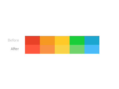
Getting the right color combinations for your projects is quite important. Especially when you have to match a range of contrasting colours. Matt Willett has found a pretty cool solution that will help you get a harmonious color scheme every time. Just follow the steps bellow.
I hope you’ll find this tip useful!

Step 1
Create squares filled wtih colors you will use in your project and place them next to each other. Group them. To see the differences, duplicate the group and place it under the first one.

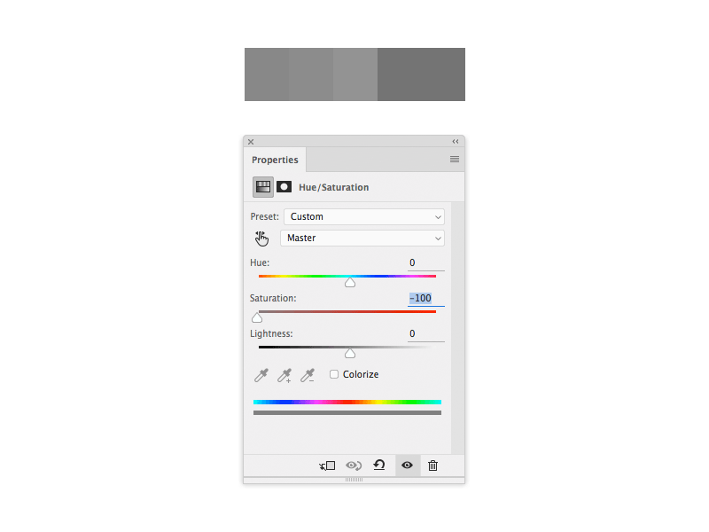
Step 2
Apply a Hue/Saturation adjustment layer over them. Set the Saturation to -100.
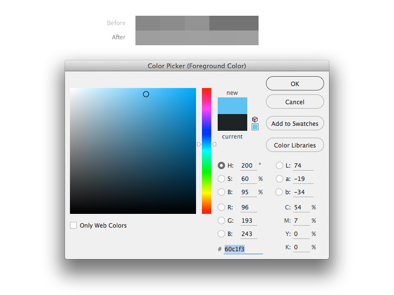
Step 3
Try adjusting the colors of the second group untill the greyscale hues match.
Step 4
After you got them matched, remove or hide the adjustment layer.